Faceburguer Conveniência ↗
O projeto teve como propósito criar uma atmosfera jovem, moderna e descontraída, sem perder a tradição do Faceburguer na qualidade dos sanduíches, no atendimento e no delivery super rápido.
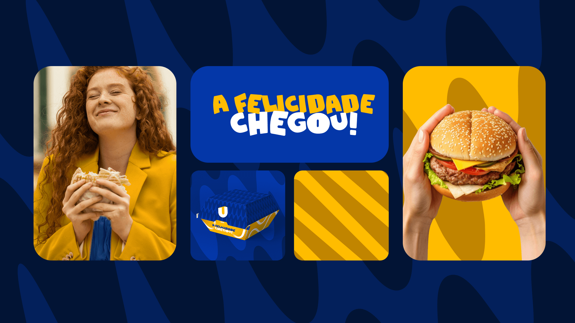
As fontes principais (títulos e subtítulos) foram selecionadas por serem mais orgânicas e joviais, que se relacionam bem com o público-alvo. As cores azul e amarelo foram indicadas pela Natallya e pelo Jean, e validadas na etapa de moodboard. Porém, foi optado por alterar o tom de ambas as cores para torná-las mais atuais e jovens, gerando esse ambiente ousado e despojado para a marca.
Quanto à decisão de não usar um símbolo específico, foi preferido focar no nome da marca para evidenciar a força que ela já tem. E, como o nome da marca é longo (Faceburguer Conveniência), foi decidido por não adicionar mais uma informação para não disputar com o foco principal (o nome da marca). Então, foi estabelecido que todo o destaque ficaria para o nome com o detalhe que foi criado.
The project aimed to create a young, modern and relaxed atmosphere, while maintaining the history of Faceburguer in the quality of the sandwiches, the service and the super fast delivery.
The main fonts (titles and subtitles) were chosen for being more organic and cheerful, which connect well with the target audience. The colors blue and yellow were suggested by Natallya and Jean, and confirmed in the moodboard stage. However, it was decided to change the tone of both colors to make them more current and young, creating this bold and casual environment for the brand.
Regarding the choice of not using a specific symbol, it was chosen to focus on the brand name to highlight the strength it already has. And, as the brand name is long (Faceburguer Convenience), it was decided not to add more information to not compete with the main focus (the brand name). Then, it was determined that all the emphasis would be on the name with the detail that was created.